Our first CorrelAidX challenge
The idea
Which state has the youngest population? Which cities are particularly popular with tourists? How did the parties do in the last European election? How much waste does Germany actually produce?
All of this data and much more is provided openly by the state statistical offices. In its original form it is inconvenient to access though and therefore not analyzed a lot. Thanks to datenguide and CorrelAid teams that developed API wrapper packages, this data is easily available and accessible with just a few lines of code in Python and R!
Now that this data is quickly and easily available, we naturally want to analyze and visualize it in the next step. To make use of this wealth of Germany wide data and our decentralized network structure, CorrelAid called on all Local Chapters to use regional data from their region and submit creative data projects over the course of 8 weeks using the python package. This is how the idea (thanks to Alex and Konrad) for the first CorrelaidX challenge was born.
In early August we launched this internal project for the local chapters all over Germany. The challenge was an opportunity for them to apply and expand their knowledge and information using what is already available out there and might potentially be used for the common good. On top of that, some of the newly founded chapters could grow together as a team over the course of the challenge.
We were thrilled to receive so many creative, outstanding project contributions which made the selection process fun and hard at the same time. All the ideas were not only creative, innovative and well designed, but also had clear data4good factors and the potential to be developed further for the common good.
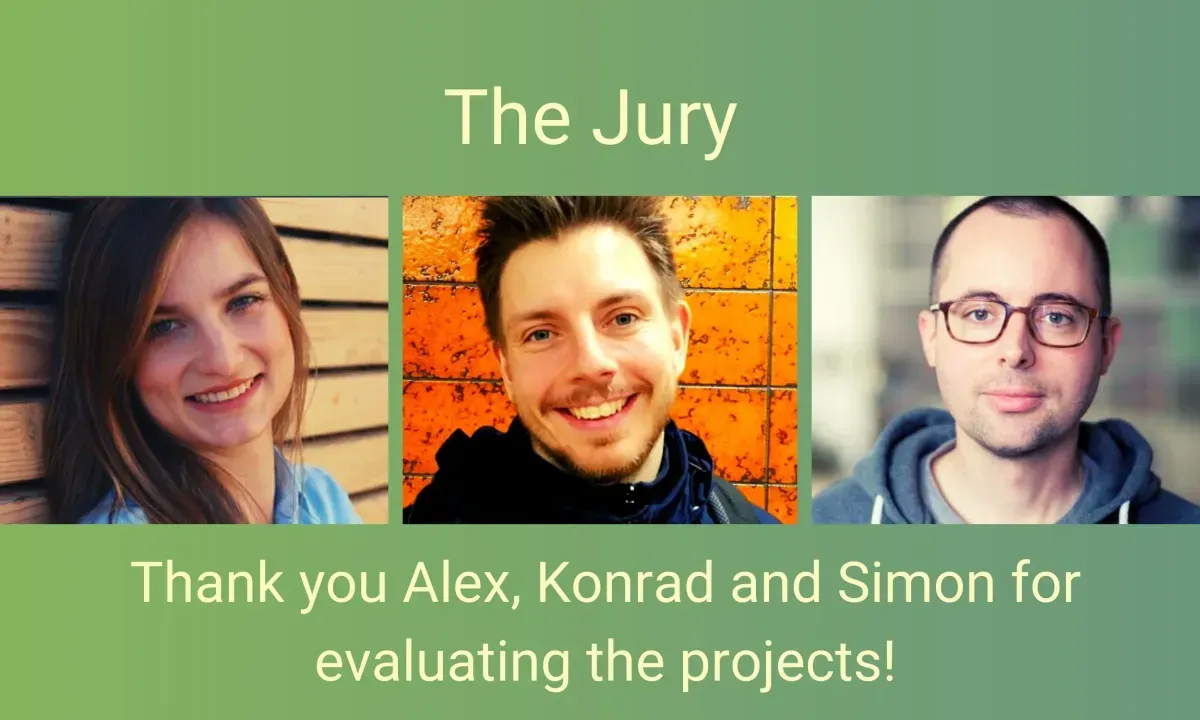
The jury
Our jury, consisting of Alex Kapp, Konrad Wölms & Simon Jockers worked very hard to evaluate the projects. They took into consideration many factors including how innovative the project idea was, how creative the visualization and design was or how well the combination of various data sets worked. They looked also carefully at the project documentation and evaluated the data for good factor.
I think it is great to see how many fantastic projects the teams have built and how diverse they are in terms of topics and technical applications.
Simon from Datenguide
And the winner is
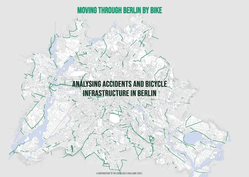
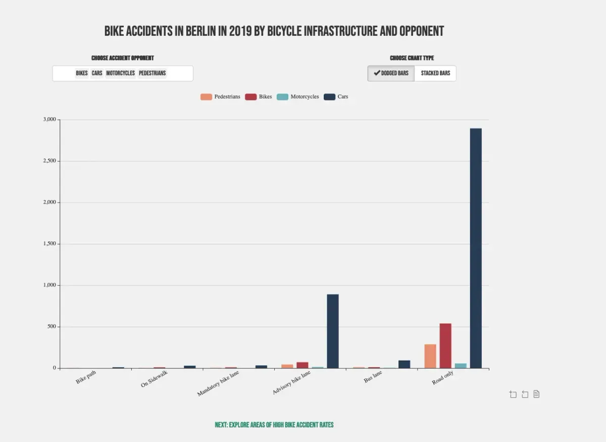
The job of the jury wasn’t easy at all, but after lots of discussions and long evaluation hours, we are pleased to finally announce the winner! And the winning local chapter ( Drum Roll) is : The CorrelaidX Berlin team! Congratulations to the team members: Cédric Scherer, Andreas Neumann, Saleh Hamed & Steffen Reinhold!
The project submitted is available here and stood out with its storytelling, taking the user from point to point combined with interactive parts using well designed graphics. They picked their data carefully and combined the datenguide dataset with external data, all focusing on the Berlin area. On top of that, there is a clear data4good potential – well done!
And these are the other impressive projects
The other four teams submitted outstanding projects, too. Here is a brief account of each one:
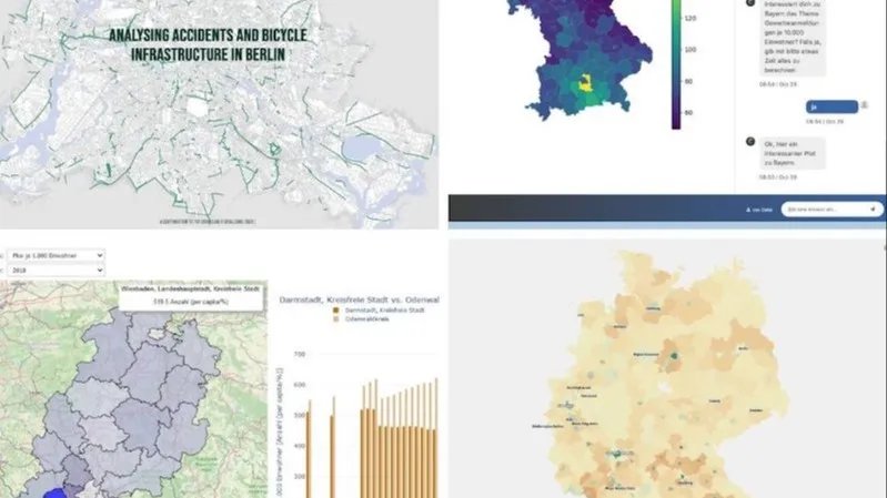
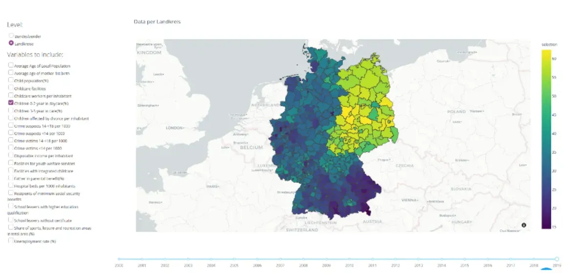
CorrelAidX Hamburg: The goal of the project “Child Well-Being in Germany” was to raise awareness to the topic and how many different factors influence the well-being of children even in rich countries like Germany. The project visualisation shows the difference in german regions on different factors which directly or indirectly touch the life of young people. It also presents the metrics evolved in the last years.
The team developed the project topic, with carefully preselected data that was even introduced and commented within the project and shows a clear social good factor. Thanks so much to Martin Wong, Vivika Wilde, Sarah Wenzel, Drenizë Rama, Long Nguyen, Trisha Nath, Christine Martens, Mauricio Malzer, Andre Kochanke, Eva Jaumann.
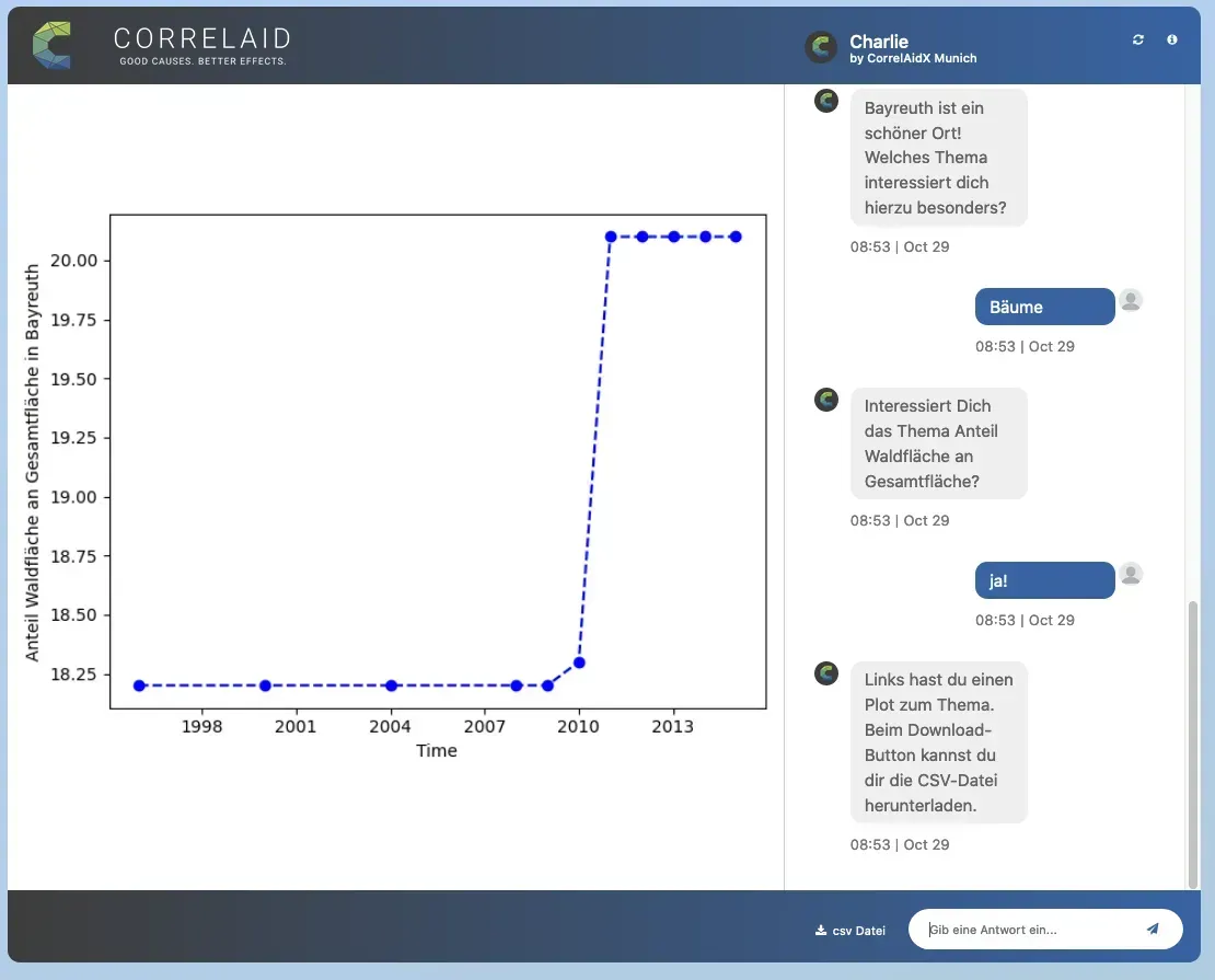
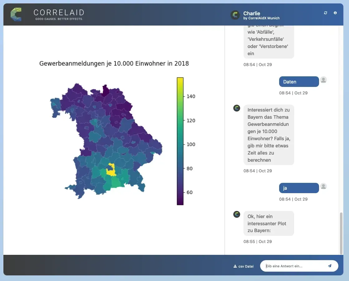
CorrelAidX Munich: The “Munich datenguide project“ creates an interface to the statistics provided by the local authorities in Germany. In order to make the data more accessible to the general public, the team built a chatbot, which utilizes the datenguide API and specifically answers the user questions and renders visualizations about diverse topics in Bavaria.
The team used a very innovative approach by setting up a chatbot with a very appealing interface, even using an external service. Probs to Pia B, Jie Bao, Daniel, Florian and Michael.
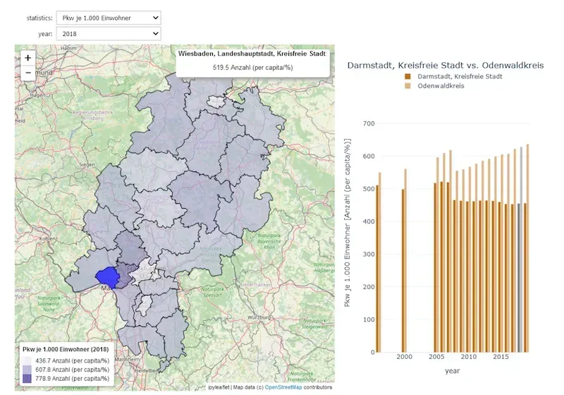
CorrelAidX Rhein-Main: The “Rhein-Main Datenguide viz” project displays various statistics about German districts of the state of Hesse. The user can compare different years and regions of the state on a map.
The team used binder to make their interactive jupyter notebook available online and had a strong focus on their region! Great Job Tim Herfurth, Aylin Ka and Benjamin Fries.
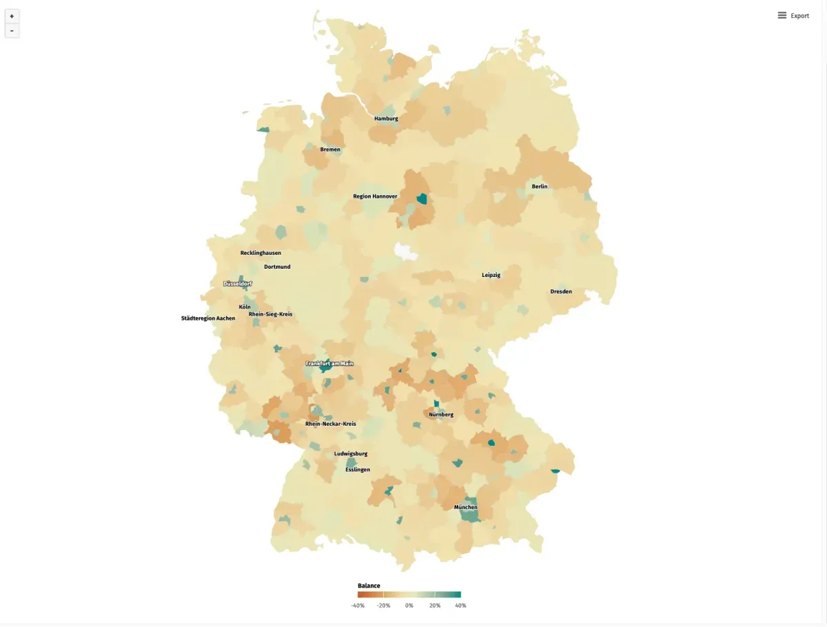
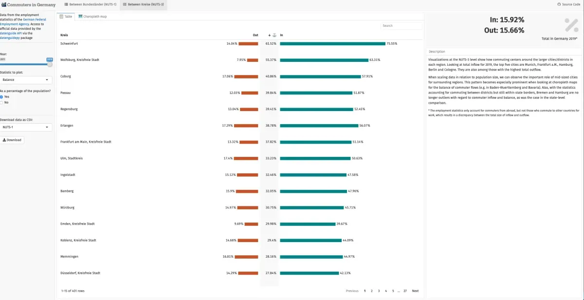
CorrelAidX Bremen: The interactive dashboard visualizes how many people have been commuting between states and districts in Germany. Check out the project here.
The team provided a great user interface that allows to switch between the NUTS levels easily with a very quick reaction. Thanks to Christine Hedde-von Westernhagen, Long Nguyen, Jan Romann, and huge thanks for Philipp, Alice, Hendrik Fiedler and Lukas Warode for their conceptual contribution.
A huge thank you to all participants and the jury
We will for sure launch another challenge next year! Many thanks to all teams and the jury for their dedicated time and effort.